Marcom & Design
The Process Behind Designing a User-Friendly Website
LantroTech Marketing
April 14, 2026
Your website often creates the first impression of your brand — and in many cases, it determines whether a visitor becomes a customer or leaves within seconds. Research shows users form an opinion about a website in just 0.05 seconds (Forbes). If a website feels confusing or hard to navigate, visitors are likely to leave before exploring what you offer.
A user-friendly website is not just about how it looks. It is about how easily people can find information, understand your message, and complete actions without frustration. Good design helps users move smoothly through the website while supporting your business goals.
At LantroTech, we follow a structured process to design websites that are simple, intuitive, and effective. From understanding user needs to testing functionality, every step focuses on creating a seamless experience.
In this blog, we will walk through the process behind designing a user-friendly website and explain how the right approach can improve both user satisfaction and business results.
Step-by-Step Process for Designing a User-Friendly Website
1. Start With Clarity, Not Creativity
One of the biggest misconceptions about web design is that it starts with colors and visuals. In reality, user-friendly websites start with clarity.
Before thinking about layouts, it is important to define:
- What should users do on the website?
- What problem is the website solving?
- What information matters most to visitors?
People do not visit websites to admire design — they visit to complete tasks. Whether someone is checking gym membership details or exploring IT services, they expect to quickly understand where they are and what to do next.
When goals are clearly defined early, design decisions become easier and more effective.
Research shows that poor user experience directly impacts engagement, with 88% of users unlikely to return after a bad experience.
This is why a structured approach always works better than jumping straight into visuals.
2. Design for How People Actually Use Websites
Users rarely read websites word by word. Instead, they scan pages looking for headings, buttons, or anything that helps them quickly find what they need.
Think about how you browse online — you probably skim headings first and only read details when something feels relevant.
This behavior influences how content should be structured:
- clear headings help users scan faster
- shorter paragraphs improve readability
- highlighted key points guide attention
When websites are designed according to natural browsing habits, users feel comfortable navigating without confusion.
User-friendly websites guide attention instead of demanding effort.
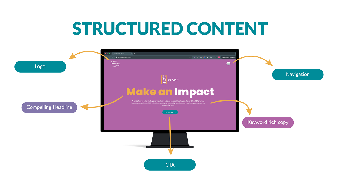
3. Structure Content So Users Don’t Feel Lost
A website should feel easy to move through, not overwhelming.
Clear navigation plays a major role in usability. When menus contain too many options or unclear labels, users hesitate and sometimes leave without exploring further.
Grouping related pages together and keeping navigation simple helps users feel in control of their journey. For example: A fitness website visitor usually expects to find pages like Classes, Trainers, or Membership.
An IT services website visitor may look for Solutions, Case Studies, or Contact.
When structure matches expectations, navigation feels natural.
Organizing content based on user priorities rather than internal company structure creates smoother experiences.
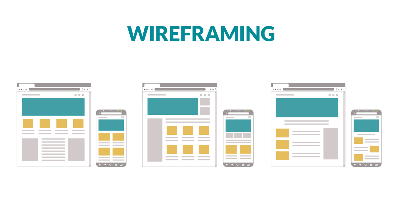
4. Create Wireframes Before Visual Design
Wireframes act as the blueprint of a website. They help visualize layout, structure, and user flow before visual styling begins.
This step helps determine where key elements should be placed, such as navigation menus, content sections, or call-to-action buttons.
Planning layout early makes it easier to refine ideas and ensure the website supports intuitive navigation.
Design tools such as Figma and Adobe XD allow teams to map user journeys and refine structure before development begins.
Clear planning reduces revisions later in the process.
5. Keep the Interface Simple and Focused
Good design does not try to impress users with too many elements. Instead, it removes distractions.
White space, consistent typography, and clear visual hierarchy help users focus on what matters.
When every section competes for attention, users may not know where to look first. But when design elements guide the eye naturally, interaction becomes effortless.
Users should never feel overwhelmed by too many colors, animations, or messages at once.
Simplicity improves understanding.
6. Make Important Actions Easy to Notice
Every website has key actions — such as contacting the company, exploring services, or signing up for more information.
These actions should be clearly visible and easy to complete.
Users should not have to search for contact details or struggle to find the next step.
Clear call-to-action buttons, visible contact information, and logical content flow help users move forward confidently.
When users immediately understand what to do next, engagement improves significantly.
7. Design for Accessibility and Inclusivity
Website performance is closely connected to user experience.
Users expect pages to load quickly and function smoothly. Even small delays can affect engagement and increase bounce rates.
Performance improvements may include:
- optimizing image sizes
- reducing unnecessary scripts
- ensuring stable functionality across browsers
- maintaining responsive layouts
Websites that load faster often see longer session durations and improved interaction rates
Speed contributes to both usability and credibility.
10. Test Early, Improve Continuously
Even well-designed websites can benefit from improvements after launch.
Testing helps identify small usability issues that may not be obvious during the design phase. For example:
- users may overlook an important button
- navigation labels may not feel clear
- certain pages may require simpler layouts
Reviewing user behavior and feedback helps refine the experience over time.
User-friendly websites are not created once — they evolve continuously.
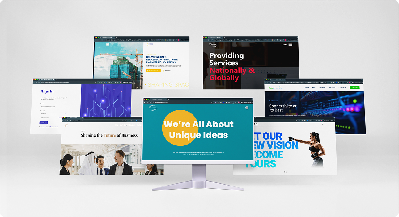
Real Examples of User-Friendly Design in Practice
Here are some examples of websites designed by LantroTech that apply the principles discussed above, including clear structure, intuitive navigation, and responsive layouts.
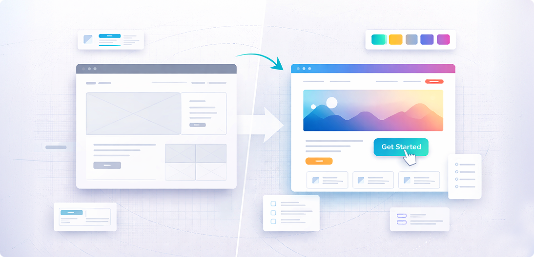
The Best Websites Don’t Make Users Work Hard
Most users don’t think about design — they simply notice when something feels difficult. A user-friendly website removes that friction. It helps people find what they need quickly, understand information easily, and move forward without hesitation.
Every small choice, from layout structure to button placement, contributes to this ease of use. At LantroTech, the focus remains on making digital experiences feel straightforward and intuitive, so users can interact without second-guessing where to click next.
Because when a website feels easy, people are more likely to stay.